
WBD-Hawaii Life TV Commercial
August 4, 2026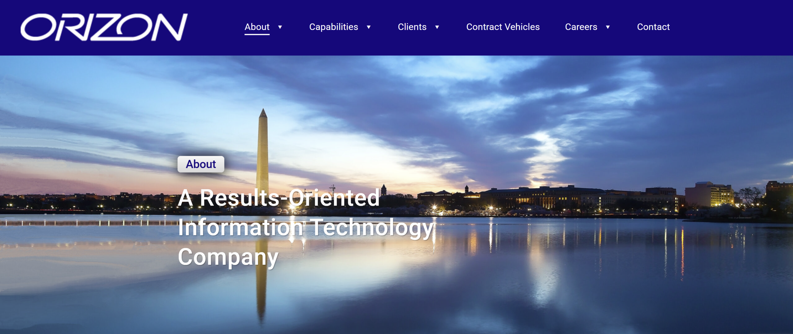
Orizon, Inc. — Corporate Website
Overview
Orizon, Inc. is a government information technology (IT) contractor founded in 1998 and headquartered in Maryland, providing advanced IT and business solutions to U.S. Government clients worldwide across the civil, defense, and intelligence sectors. As a part-time UX/UI Designer, I contributed to the design and ongoing evolution of Orizon's public website , the primary tool the company uses to establish credibility with federal contracting officers and prospective government clients.
The Challenge
A government contractor's website carries a different burden than a typical marketing site. Its primary visitor is a contracting officer or procurement evaluator who needs to quickly verify capability, past performance, and credibility signals like certifications and contract vehicles. The site however, also has to hold up for prospective teaming partners and prospective employees sizing up the company. The site needed a clear, navigable structure across a fairly complex set of content areas, capabilities, past clients, contract vehicles, careers, without overwhelming a time-pressed, skeptical visitor, whichever of those audiences they belonged to.
The Process
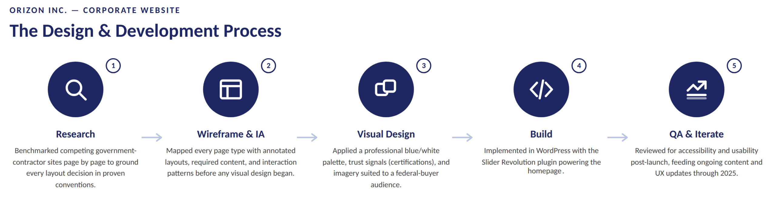
1. Competitive & Comparative Research
Before any wireframing began, other established government-contracting sites were reviewed for approaches that stood out as effective, visually appealing, and worth adapting into the new site. Rather than designing in a vacuum, specific sites were identified as inspiration for different sections — treatments that already appealed to us and that we wanted to echo with a similar approach. These included:
- Homepage scrolling tagline treatment
- About, Capabilities, Clients, and Careers page layouts
- Contract Vehicles and Careers content approach
- Job listings page structure
2.Wireframe and Information Architecture (IA)
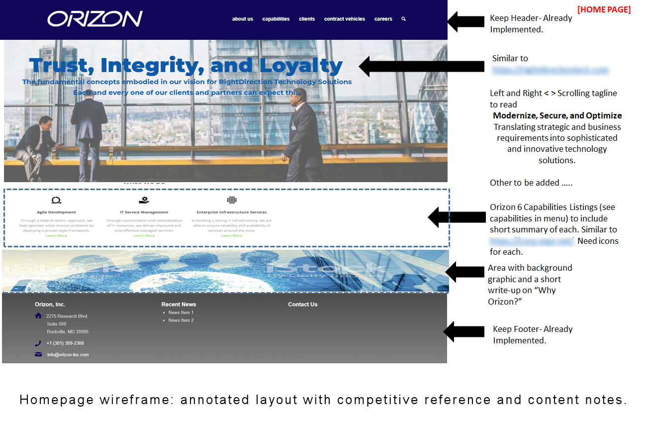
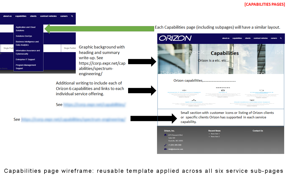
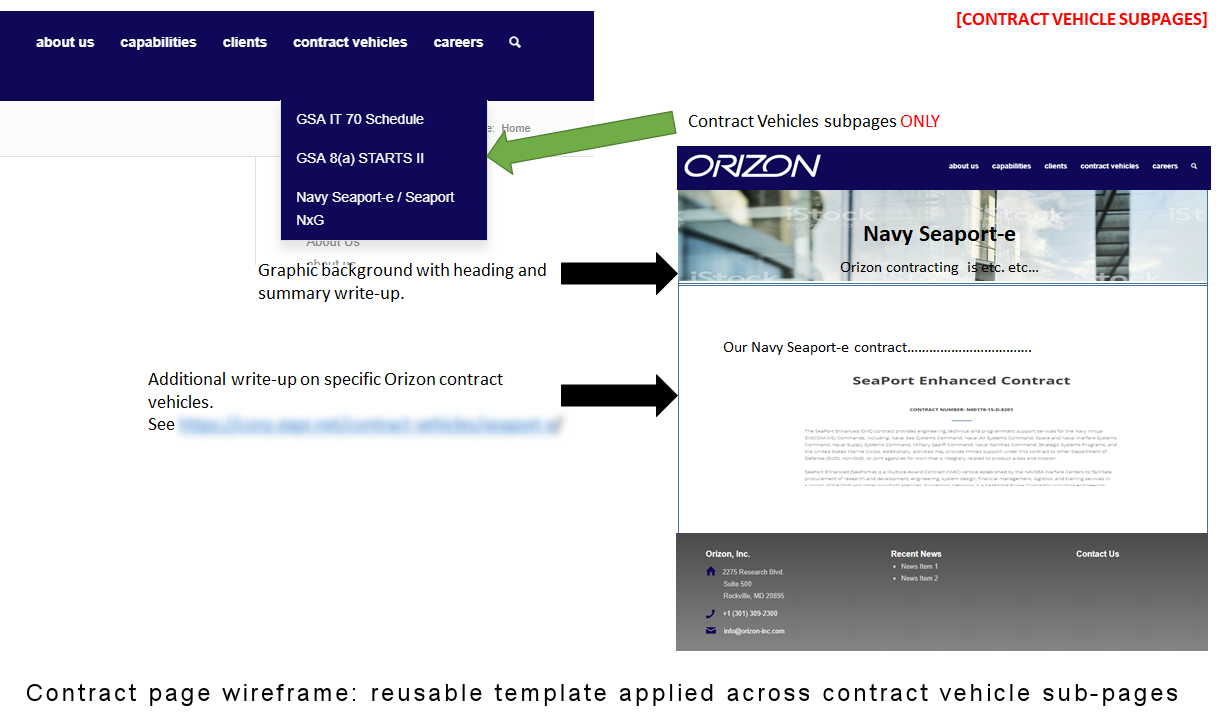
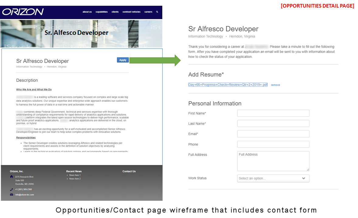
Orizon already had a defined brand style guide to ensure consistent use of fonts, colors, and visual elements across its marketing materials. Using that as the foundation, we developed a comprehensive wireframe deck that mapped every page type on the site, Home, About, Capabilities, Clients (main and Project Successes), Contract Vehicles (main and sub‑pages), Careers, Opportunities, and Benefits.
Each wireframe included annotated notes detailing layout expectations, required content, and interaction patterns. Examples included the left‑right scrolling tagline on the homepage and the horizontal client‑logo carousel on the Clients page. This documentation established a clear visual and functional blueprint for the build and ensured that every page aligned with the brand’s identity and user‑experience goals.
Annotating each wireframe with the specific content that was still needed (short capability summaries, icon requirements, client write-ups) meant that the deck also doubled as a content strategy document, showing exactly what content, imagery, and structural elements each page still required before it could go live.
3. Visual Design and Build
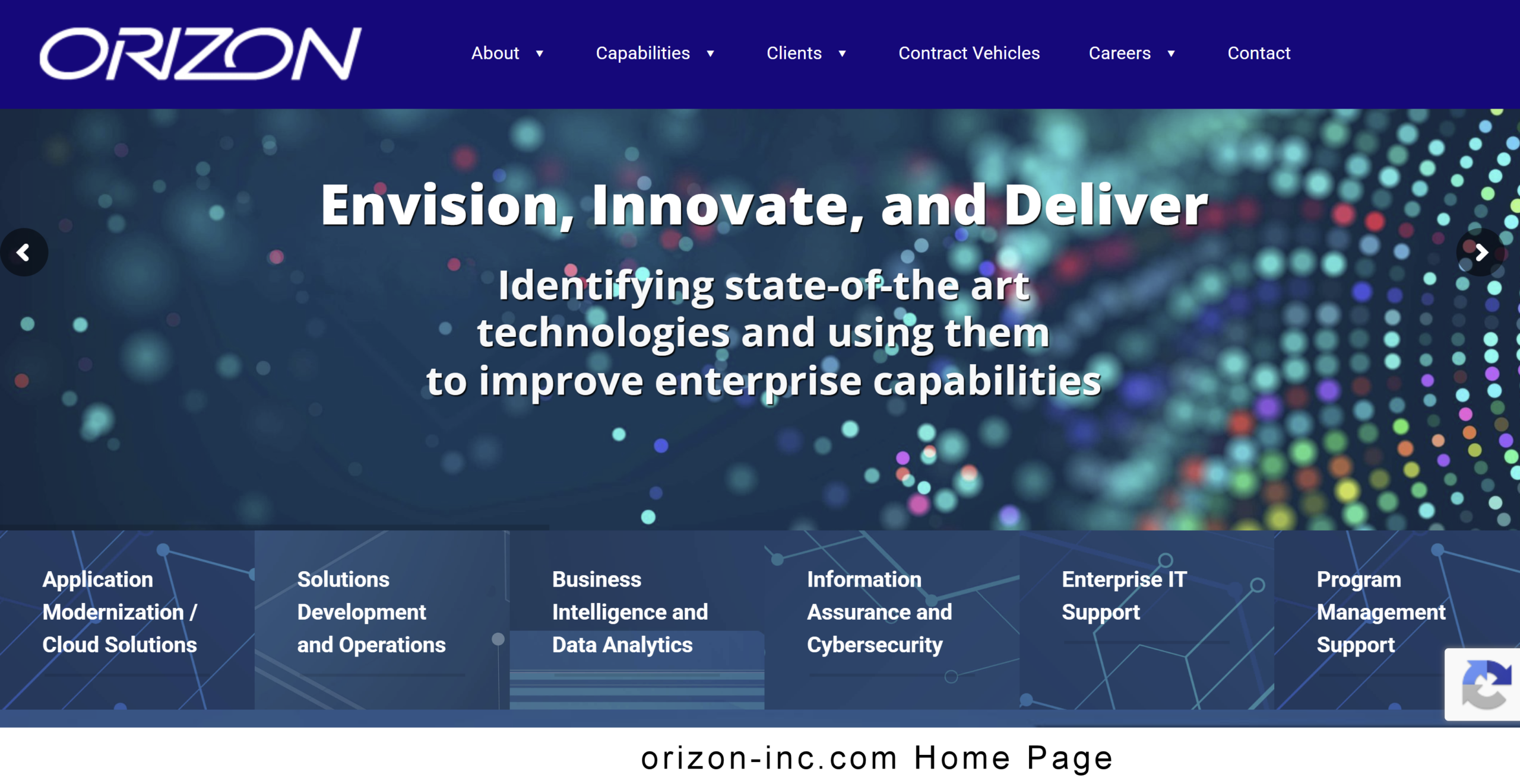
The final site was built usinjg the BeTheme template and WordPress. We used a few third party plugins including the Slider Revolution which we used to create the homepage’s rotating hero messaging, and the Contact Form 7 for the site's contact form page. As part of the development, we used as much out-of-the-box functionality as possible and kept scripting/custom code to a minimum to make future upgrades easier.
The visual design used a clean blue-and-white professional palette tailored to a B2B and government audience, that was complemented by parallax background sections that added visual depth and engagement. Prominent certification logos featuring PMBOK, CMMI Level 3, and ITIL credentials were intentionally incorporated as a trust signal, reinforcing the organization’s expertise and credibility for prospective clients and evaluators.
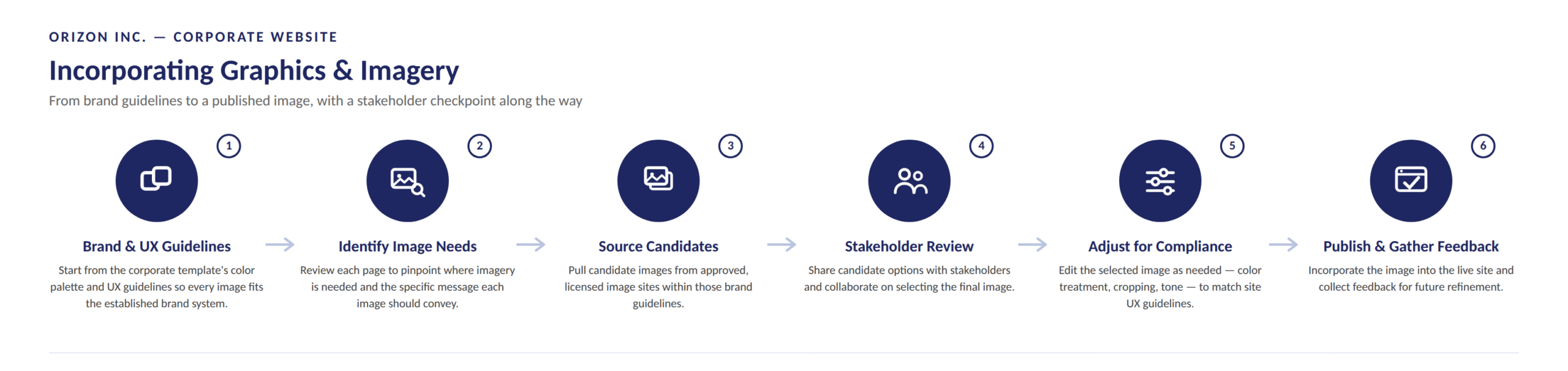
Incorporation Graphics - I used the six-step process outlined below to incorporate graphics into the site.
- Brand & UX Guidelines — started from the corporate color palette and UX guidelines
- Identify Image Needs — reviewed each page for where imagery is needed and what message it should convey
- Source Candidates — pulled options from approved, licensed image sites
- Stakeholder Review — shared and collaborated on selection
- Adjust for Compliance — edited color, cropping, tone to match site guidelines
- Publish & Gather Feedback — incorporated into the live site and collect feedback
4. Content Delivery vs. Original Scope
The core structure of the live site launched largely as planned. A few elements originally scoped, such as an “Opportunities” job board and a database for tracking job openings were scrapped due to the ongoing maintenance complexity they would have introduced. The Contact Form was also replaced with a simpler alternative to streamline implementation and troubleshooting. These adjustments were driven primarily by the functional requirements and limitations of the plugins involved.
Outcome
The site has been in continuous use as Orizon's primary public-facing credibility tool since launch, maintained and iterated on through the past years based on content updates and usability feedback. The wireframe-driven process and documenting content requirements alongside layout, has kept this multi-page, multi-stakeholder site consistent in structure and tone across every section.
Keeping Content Fresh: Ongoing Content Management
The company placed a strong emphasis on keeping the site’s content current and accurate. Because the site’s primary purpose is to establish credibility with contracting officers, outdated capabilities and/or project performances would undermine the trust the design was intended to build. Content upkeep was treated as an ongoing operational cycle rather than a post‑launch afterthought. I was responsible for monitoring changes in the business (such as new contract awards), drafting updated or new content, presenting those revisions to stakeholders for review, incorporating their feedback, and publishing the approved updates. This process kept the site aligned with the company’s evolving work and ensured it remained fresh, credible, and confidence‑building. The steps below shows our approach to keeping the sites content up-to-date.
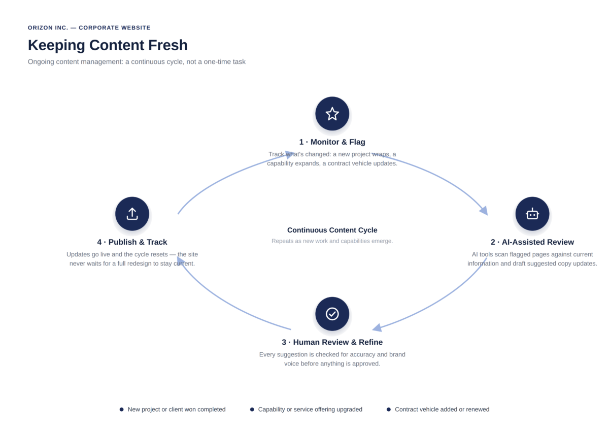
- Monitor and Flag - Site content is reviewed against actual changes in the business. These updates typically stem from a new being awarded, additional/expanded project work, new company capabilities or contract vehicles, or recent contract awards. As a result, pages aren’t revisited on a fixed schedule, they are updated whenever the business evolves.
- AI-Assisted Review - AI tools such as Microsoft Copilot are used to fold business changes into existing content and generate draft copy updates. This provides a faster first pass than manually rewriting each section from scratch and helps surface inconsistencies that might slip through during a manual review of a multi‑page site
- Human Review and Refine - Every AI-drafted suggestion is reviewed and checked for factual accuracy, and edited as needed to match Orizon's brand voice.
- Publish and Track - Approved updates go live. The practical benefit is that the site can absorb a new past-performance win or an updated capability quickly.